¶ Analysis
All the data that will be shown here are fictitious and used for demonstration purposes only.
¶ What is Analysis?
Made4OLT Analysis offers an intelligent solution proposal to monitor and analyze the health of your system. Instead of doing a manual search, we provide a summary of several points that our system monitors, optimizing the correction of faults and ensuring greater customer satisfaction with your service.
¶ What is Analysis for
Analysis does exactly what its name suggests. When selecting an OLT, the system provides an analysis of how the service is doing in that OLT, with various information relevant to you, such as the health of the OLT, percentage of use and the health of the PONs, among others.
¶ How to use Analysis?
¶ First let's get to know the interface.
Using Analysis is quite simple.
-
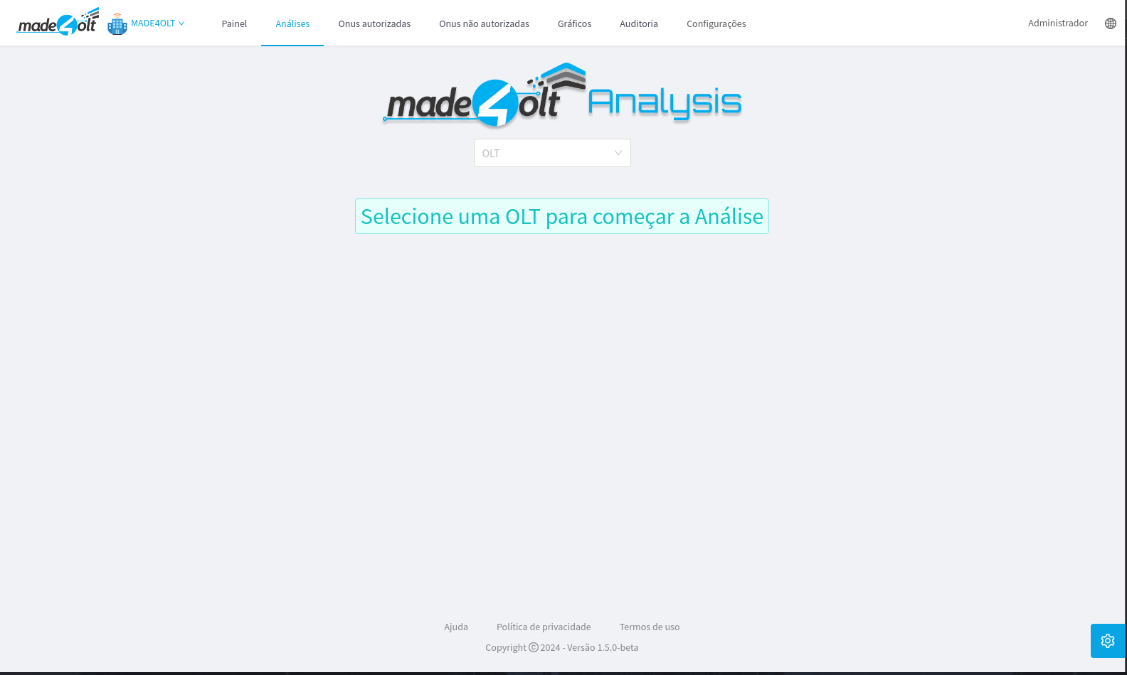
The first screen you'll see will be:
-
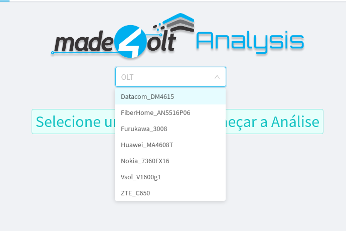
The first step is to select the OLT that you want to view the analysis for.
-
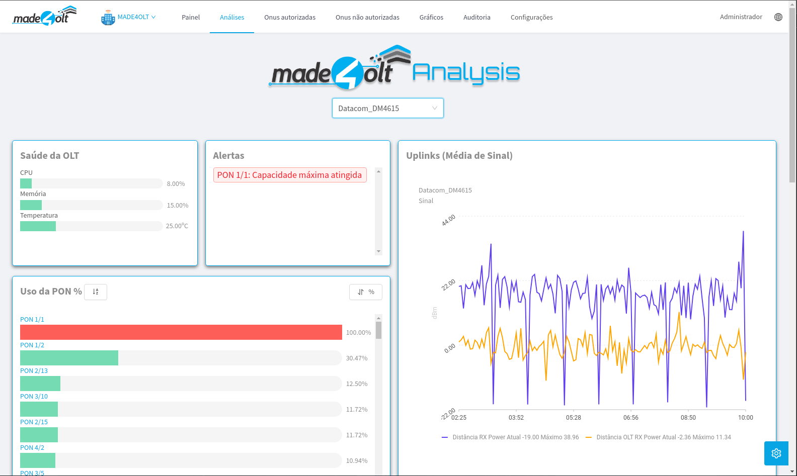
After selecting an OLT, the Analysis screen will load.
¶ Now that we know the basics, let's get down to the details.
- OLT Health.
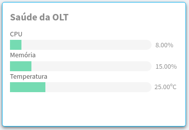
- Here, information from the OLT is displayed, such as the percentage of CPU and Memory usage, in addition to the temperature in degrees Celsius. The color of the display bars changes between green, yellow, and red, depending on the quantity used.
- Alerts
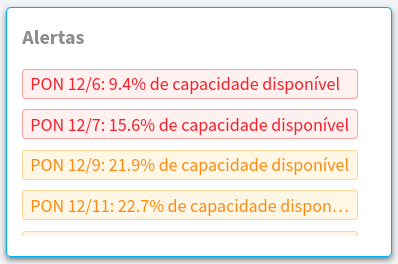
- Here, alerts are displayed in the form of tags, indicating which point of your system requires attention, from the high use of OLT resources to the capacity of the PONs. In the latter case, the alert tells you what percentage of the PON is still available for use.
- Use of PONs
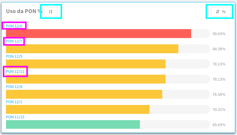
- Here you can see the usage as a percentage of each PON registered with the selected OLT.
- The highlighted places are clickable, the ones highlighted in blue are responsible for sorting them, in order of numbering the PONs or by their percentage of use.
- The purple highlights, on the other hand, work like a filter.
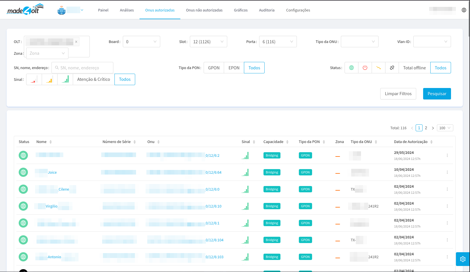
- By clicking on the purple highlights, you will be redirected to the list of authorized ONUs, with the filters applied so that you can view only the ONUs belonging to that PON.
- Uplinks
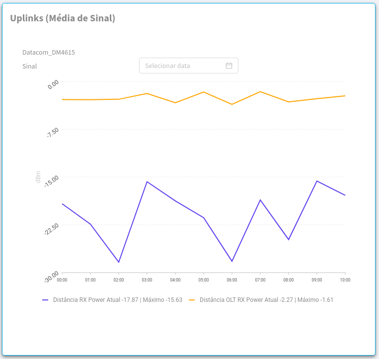
- Here you can see the graph of the average signal of the uplinks of the selected OLT, making it easier to see moments of decline in signal quality. In addition, it is possible to see the history of a few days ago, and it is only necessary to select the day in question in the select above the graph.
- By default, the chart will display information starting at 00 o'clock until the current time. If you select a date other than the current one, the graph will load information for the 24 hours of that day.
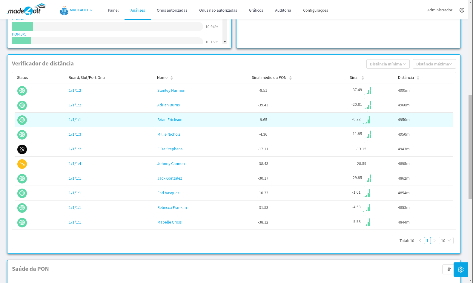
- Distance Checker
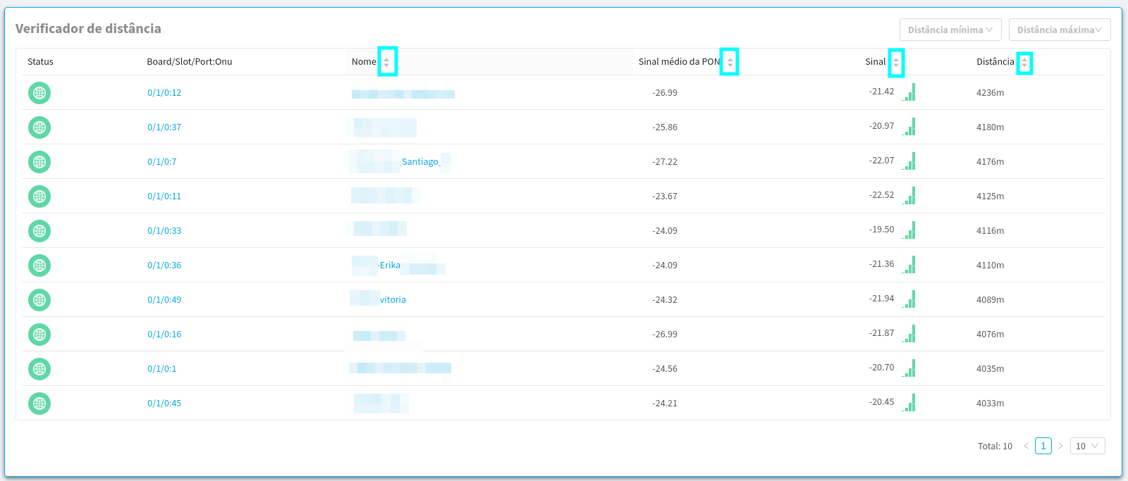
- Here, the top 10 ONUs that are farthest away from the selected OLT will be displayed. Initially, they will be ordered from the farthest to the nearest, however, you can select the ordering form you want from these 10, either by name, average PON signal, UN signal, or by distance.
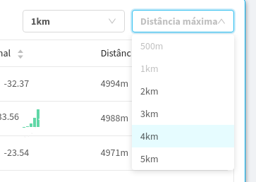
- In addition, in the upper right part, a filter has been implemented so that you can select in which range you want to view the ONUs.
- After each selection, the ONUs will be loaded according to the selected values.
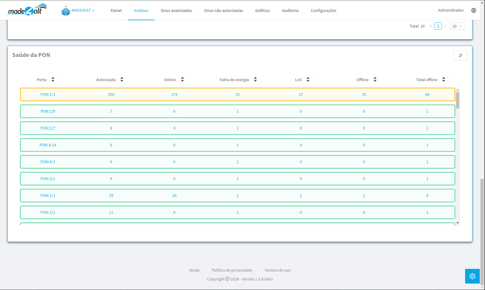
- Health of the PONs
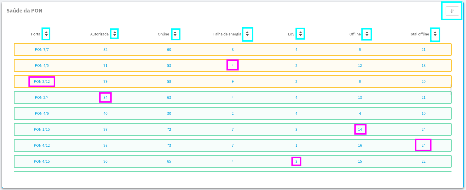
- Here, information regarding the health of the PONs will be displayed, providing feedback on the total number of ONUs authorized in each PON, as well as the number of ONUs that are online, with a power failure, with a loss of signal, that are turned off and a visual return of the current health of the PON.
- All the highlighted points are clickable, with the blue ones responsible for sorting and the purple ones acting as filters. Each column will apply a different filter based on its name.
- Example 1: When clicking on the 'Online' column, from 'PON 5/6', the following filter will be made:

- It can be seen that the applied filter brought only the ONUs of the selected PON that are online.
- Example 2: When clicking on the 'Power Failure' column of 'PON 12/5', the following filter will be made:
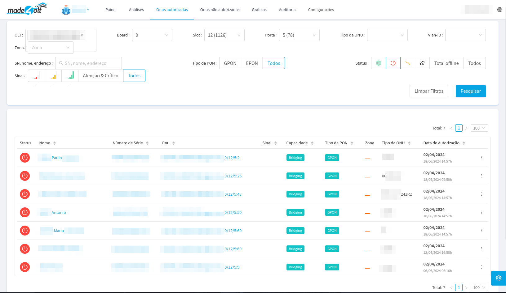
- It can be seen that the applied filter brought only the ONUs from the selected PON that are experiencing a power failure.
¶ Conclusion
With that, we concluded the tour of using the Analysis screen. Thank you!