¶ Radius Analytical Dashboard
This page provides a detailed view of the new Radius analytical dashboard, which uses data from the table
radacctand allows you to filter by date to generate various informational graphics.
¶ Overview
The new Radius analytical dashboard was designed to provide detailed insights into network utilization, performance, and customer behavior. Through it, it is possible to apply date filters, allowing an accurate analysis of specific periods.
¶ Main Features
¶ Data Filters
The dashboard allows the selection of a date range, with start and end values, to customize the analysis according to the desired period.
¶ Available Graphics
Below are the graphs that can be generated based on the filtered data:
-
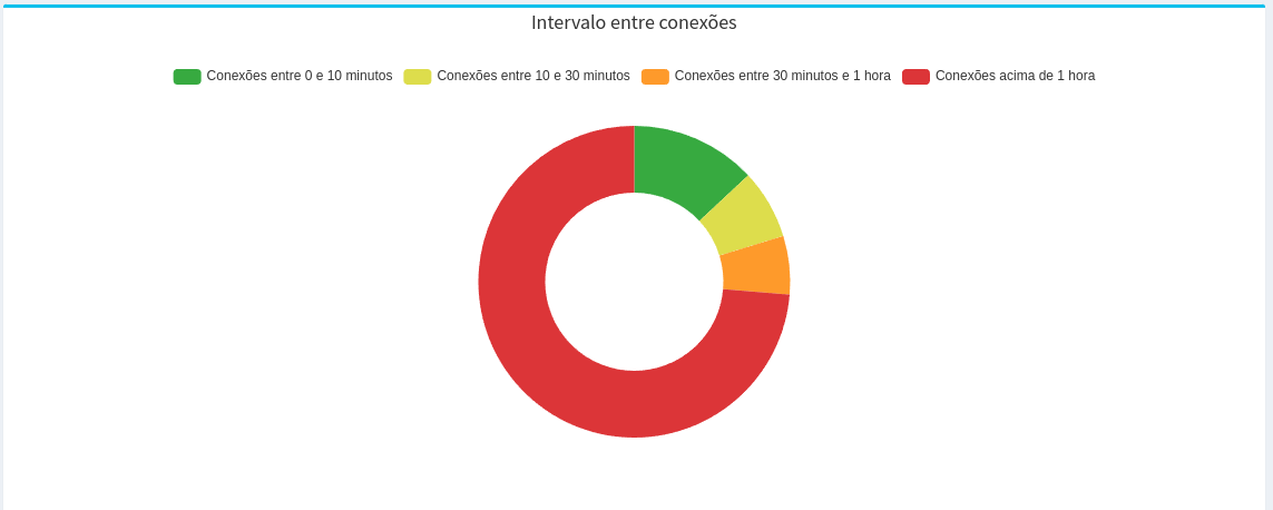
Interval between Connections
- This graph shows the distribution of time between client connections.
- This graph shows the distribution of time between client connections.
-
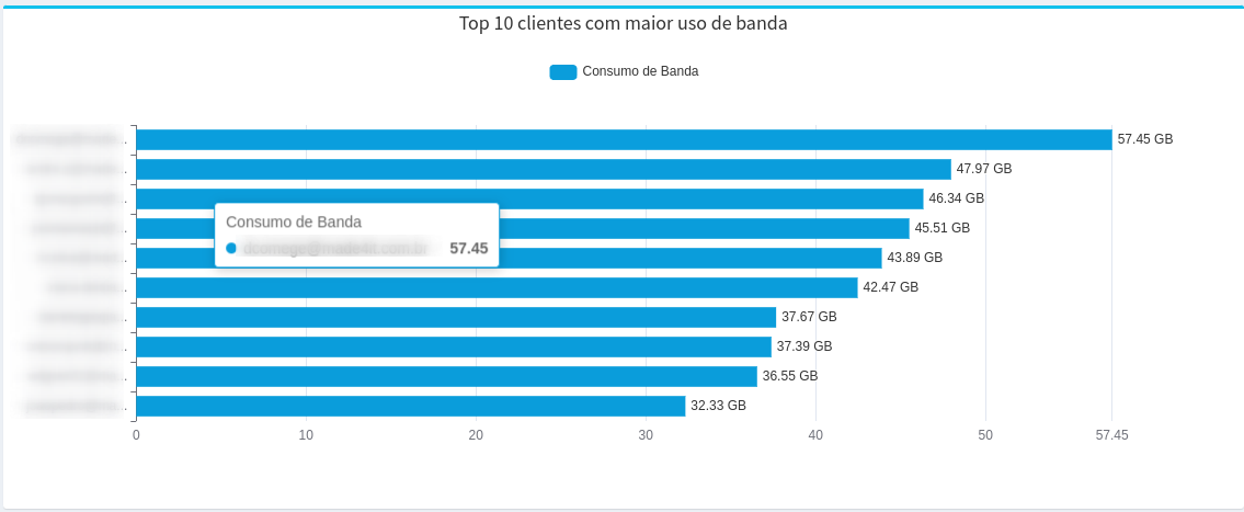
Top 10 Customers with the Highest Use of Bandwidth
- Displays the ten customers who used the most bandwidth within the selected period.
- Displays the ten customers who used the most bandwidth within the selected period.
-
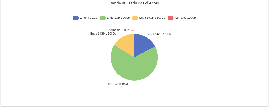
Band Used by Customers
- Shows the total amount of bandwidth used by all customers.
- Shows the total amount of bandwidth used by all customers.
-
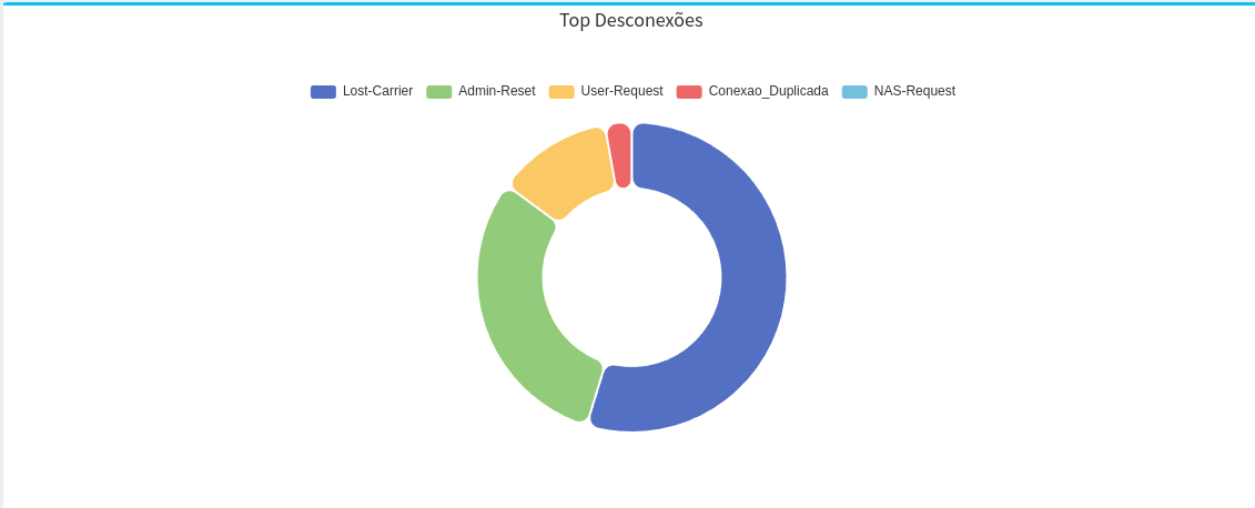
Top Disconnects
- Lists the reasons for the most frequent disconnections that occurred during the period.
- Lists the reasons for the most frequent disconnections that occurred during the period.
-
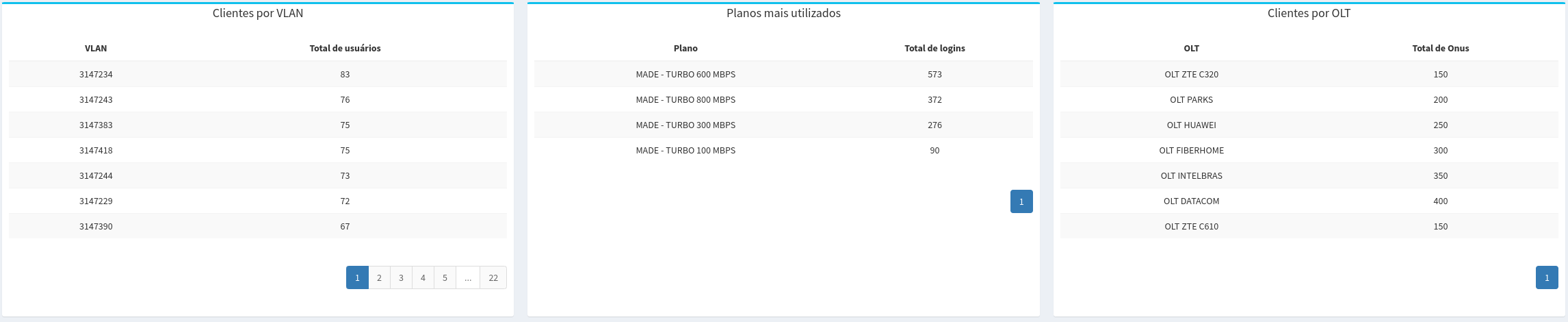
Clients per VLAN
- It shows the distribution of clients by the different VLANs.
-
Most used plans
- Details the number of logins per plan.
-
Customers by OLT
- Details the customers segmented by OLT, requiring integration with Made4OLT.
- Details the customers segmented by OLT, requiring integration with Made4OLT.
-
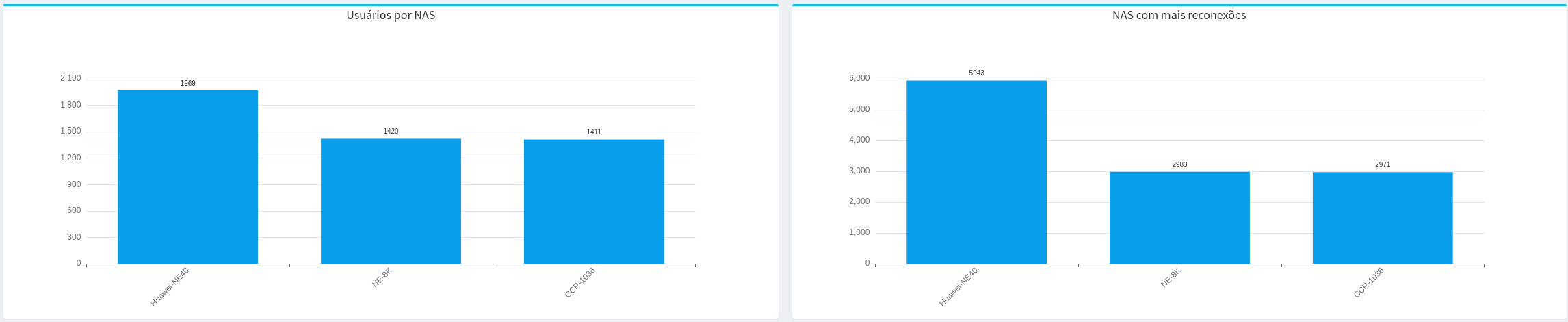
Users per NAS
- Displays the number of users connected by each NAS registered with the MADE4GRAPH tool.
-
NAS with More Reconnects
- Identifies the NAS with the highest number of reconnects.
- Identifies the NAS with the highest number of reconnects.
-
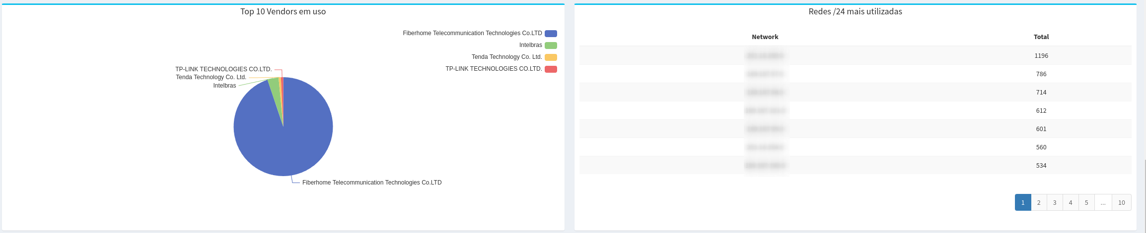
Top 10 Vendors in Use
- It lists the ten device manufacturers most used by customers.
-
Most Used /24 Networks
- Shows the most frequently used /24 subnets.
-
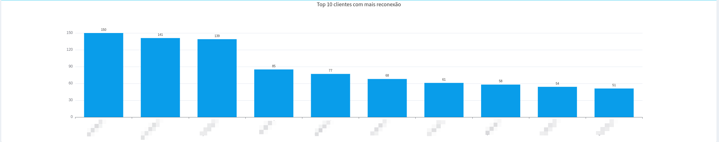
Top 10 Customers with the Most Reconnects
- Displays the ten clients that reconnected the most during the period.
- Displays the ten clients that reconnected the most during the period.
-
Disconnection per Day
- Shows the number of disconnects per day within the selected interval.
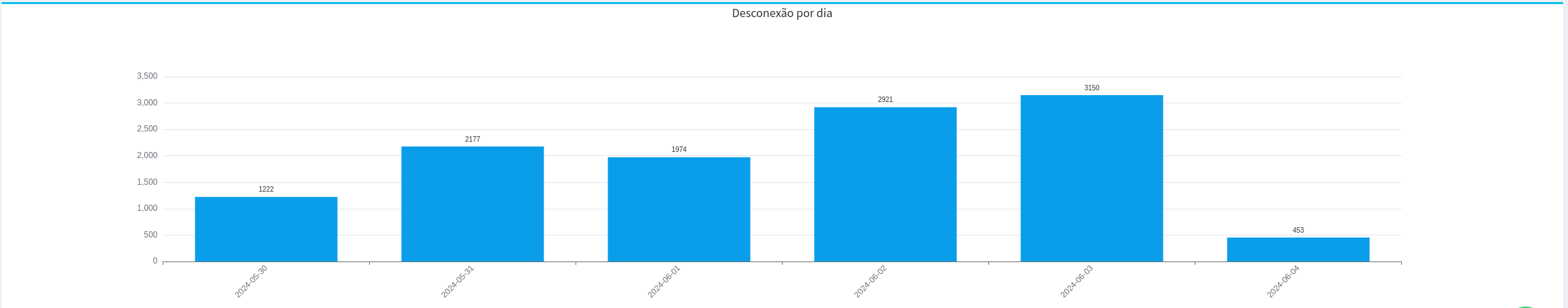
- Shows the number of disconnects per day within the selected interval.
¶ Use
To use the dashboard:
- Access the tool through the Radius Dashboard tab.
- Select the desired date range using the “From” and “To” fields.
- View automatically generated charts based on table data
radacctandusergroup.
The Radius analytical dashboard is a tool for analyzing connection data, allowing a clear and detailed view of network usage and client performance, and some dashboards such as Top 10 clientes com maior uso de banda, Top 10 clientes com mais reconexões and Desconexão por Dia clicking takes us to specific reports.
Note: Dasboards are currently being generated only for Mysql-type database integration.